Wearitt: Building a design system for mobile wardrobe app
Role
UX Design Intern
Timeline
December 2025 - May 2026
Team
2 UX Design Interns 3 UX Designers
Tools/Skills
Figma, Design Systems
Problem
Too many features.
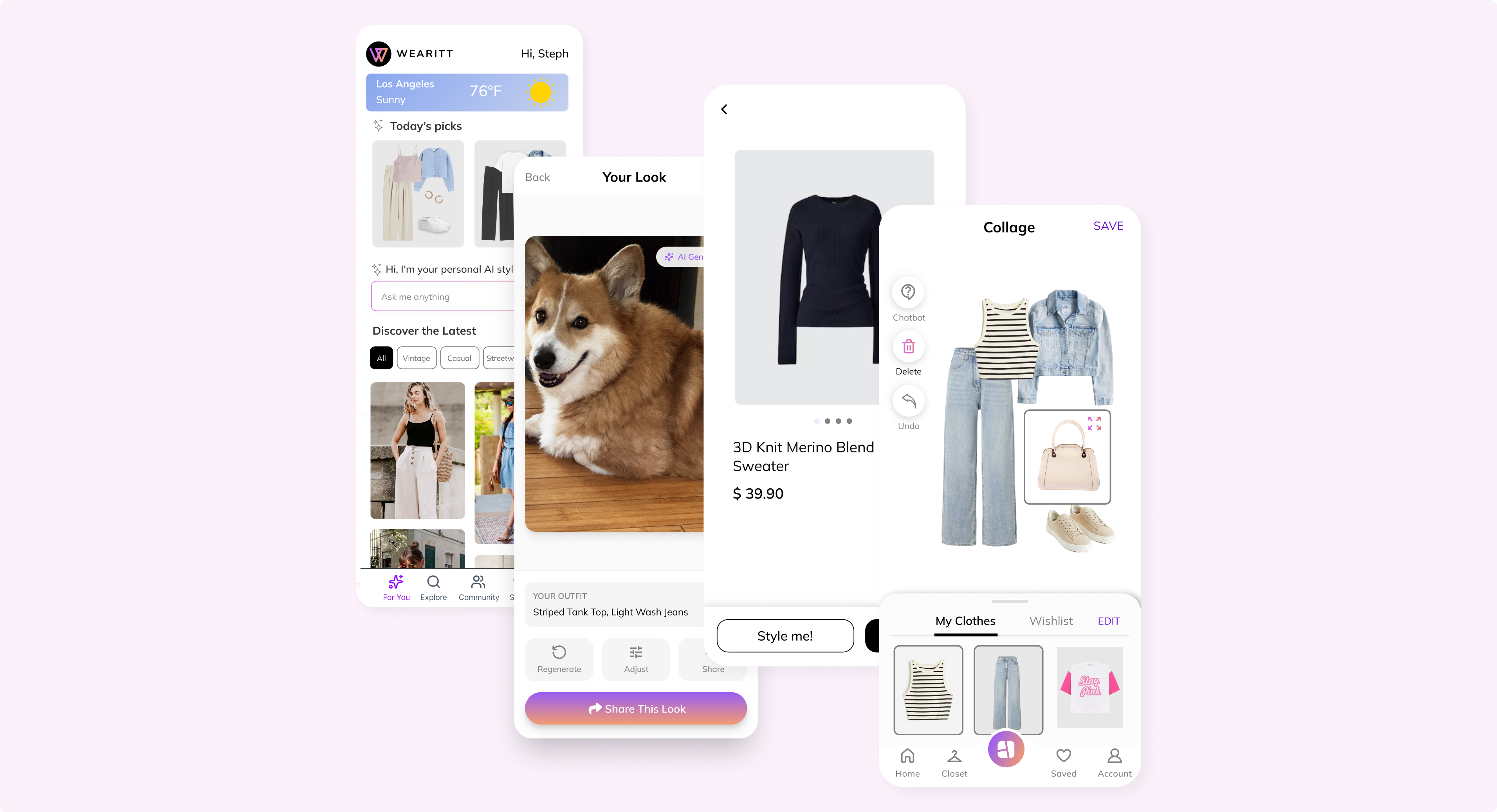
Wearitt was fractured across four competing features: Virtual Try-On, Collage Maker, Digital Closet, and an Inspiration Feed.
Goal
How might we create a unified framework that pulls four disconnected features into one seamless flow?
Process
Create a scalable design system that unifies the fragmentation across Wearitt’s features.
Started by auditing Wearitt’s active features alongside industry design systems to identify recurring UI patterns. I mapped out which components needed strict standardization, which required flexibility, and which were feature-specific.

Design Language
Defining core visual rules.
Established core visual rules, including color palettes, typography scales, spacing, and icons.
Color
Primary and secondary colors inspired by the existing brand logo.
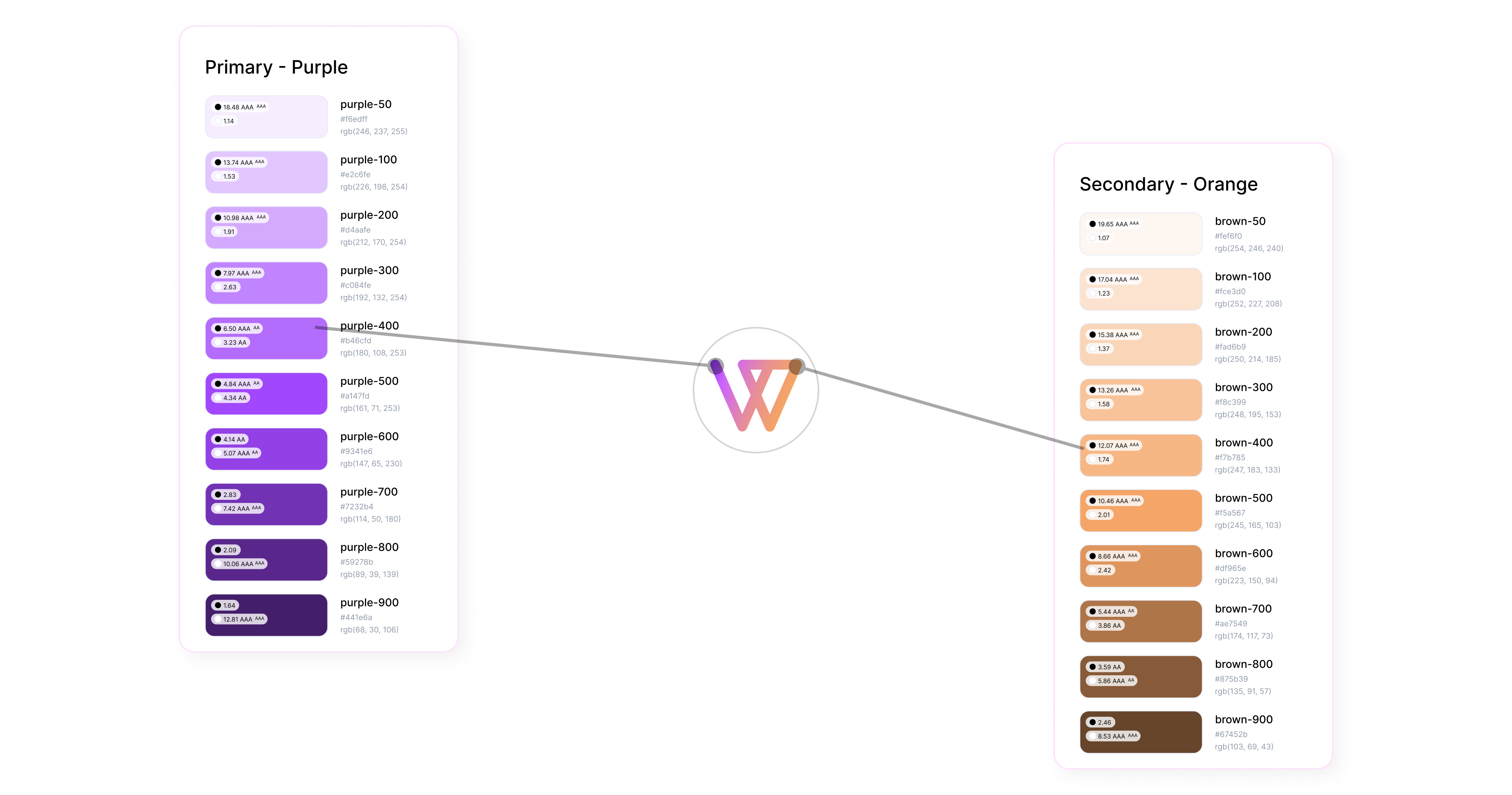
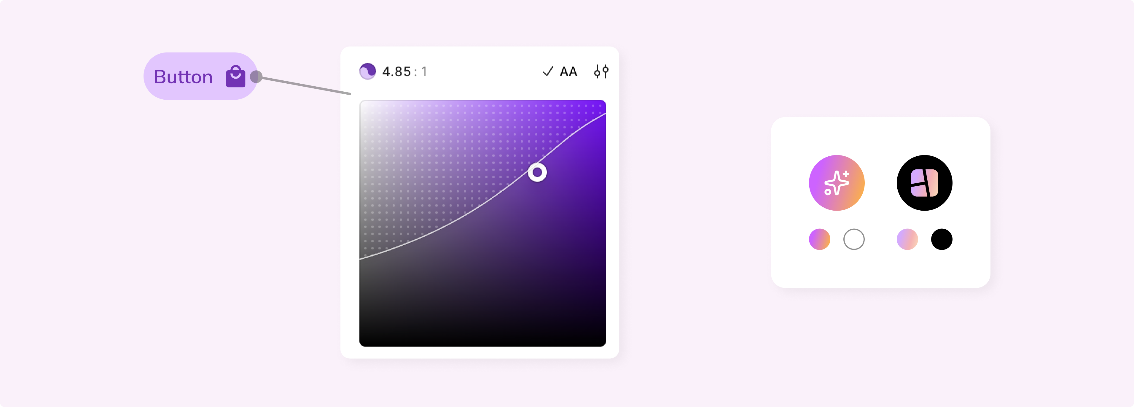
Light and dark tones selected to support accessibility, meeting WCAG AA contrast standards. Furthermore, gradient tones used in special brand moments.
Typography
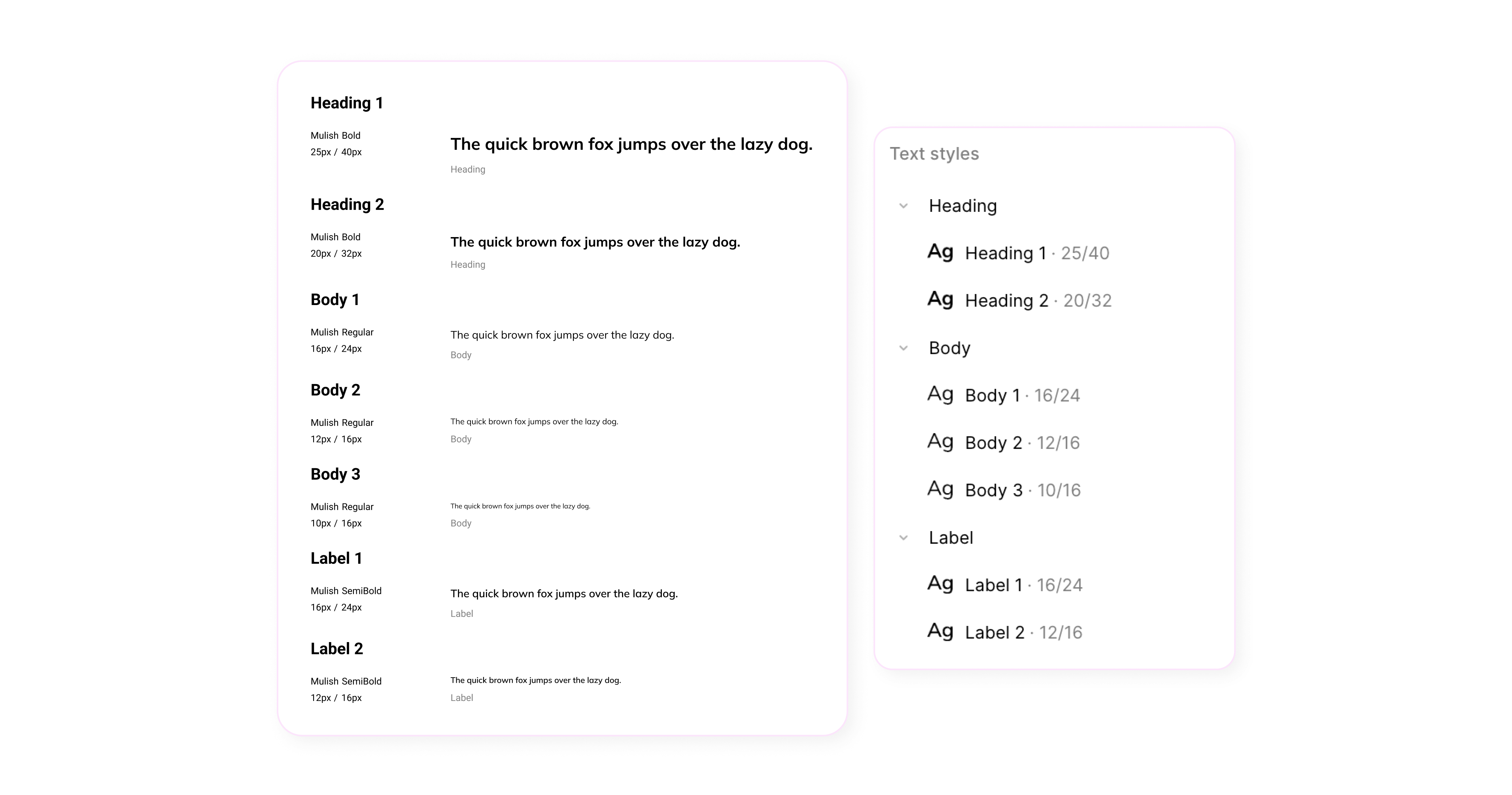
Typography needed to stay consistent and simple to accommodate for mobile usage.
Spacing
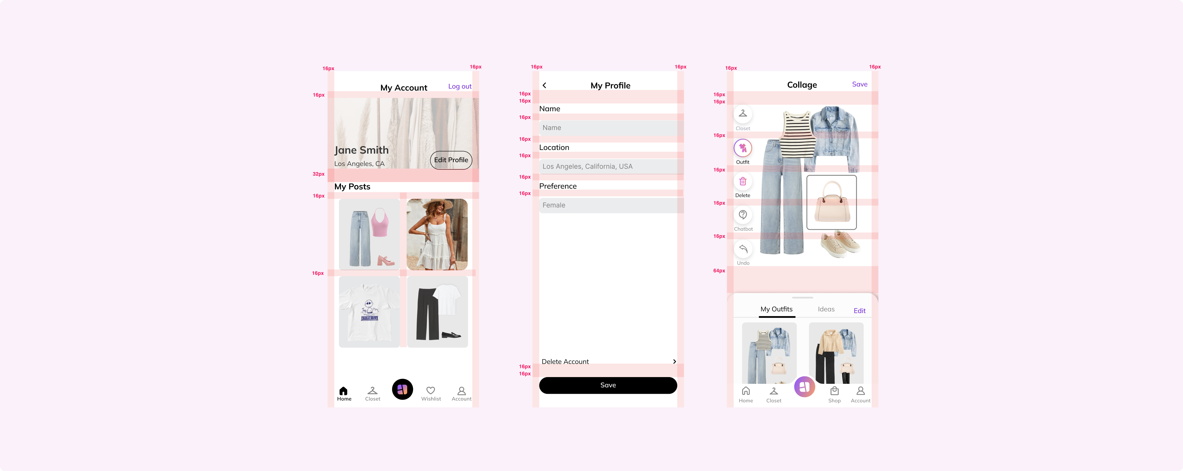
Margins and spacing were all over the place. Followed consistent 16pt spacing and margins to ensure cohesiveness.
Icons
Set range of icons with various colors for different states and usages.

Components
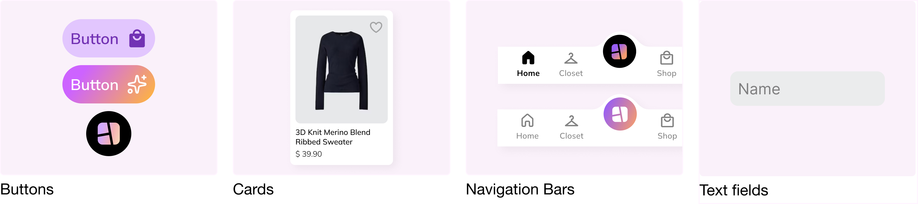
Building blocks.
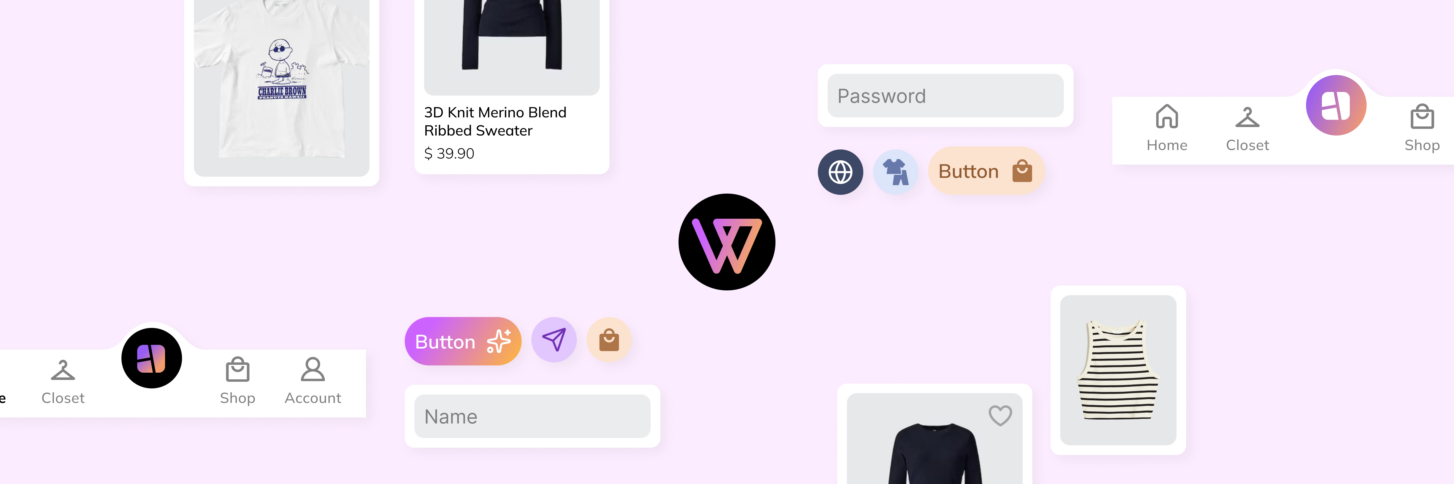
Identified commonly used components to assemble foundational tokens into reusable units.
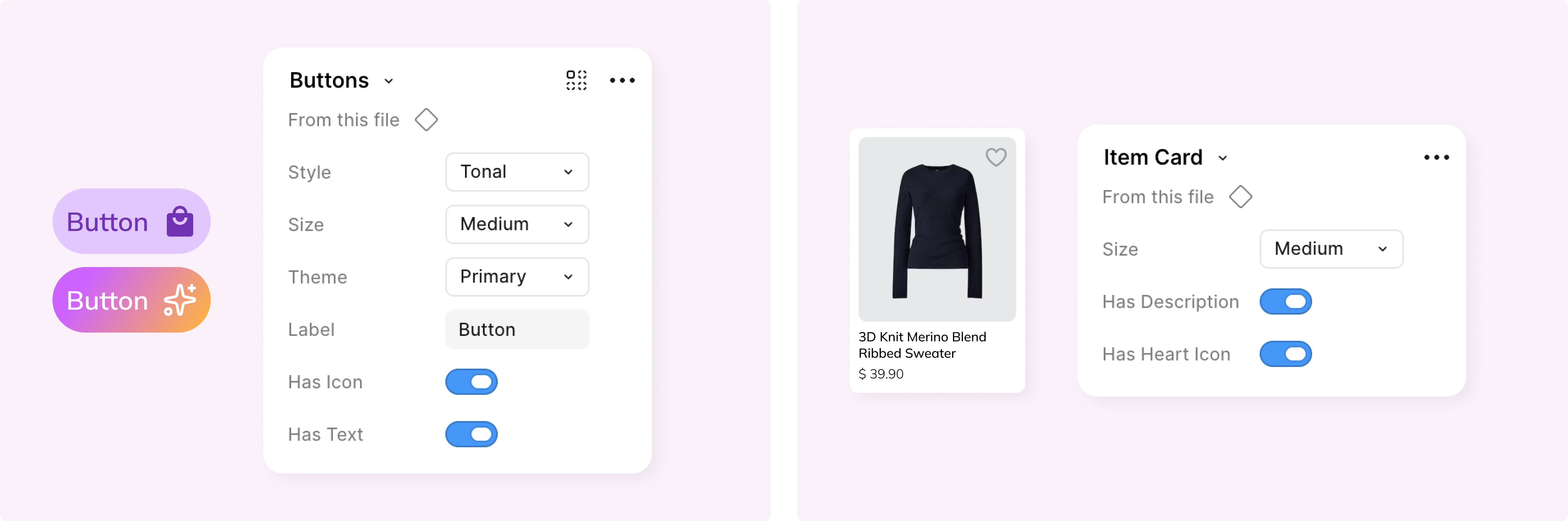
Properties
Various properties allow for quick changes and modifications.
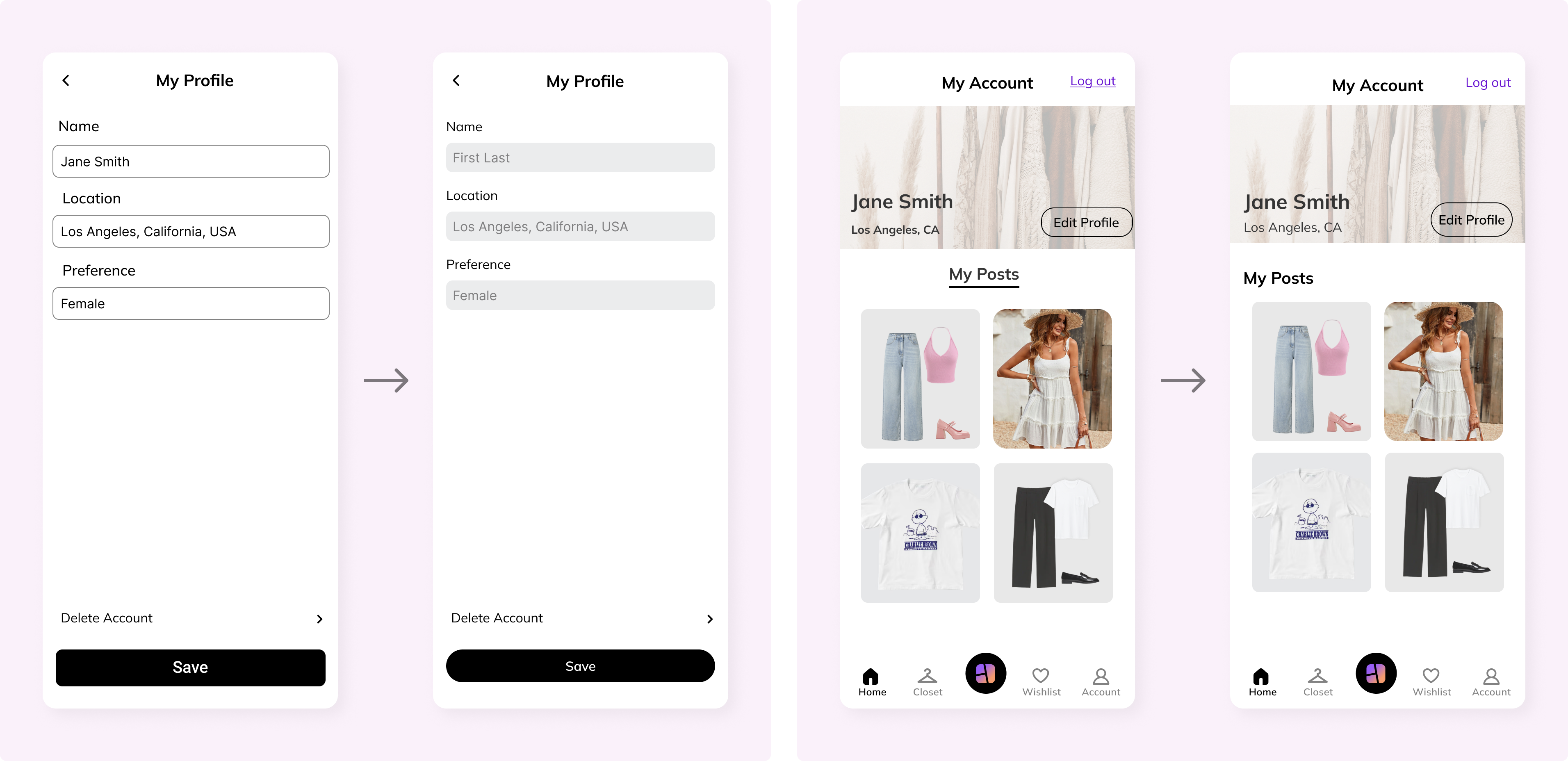
Result
A structured, cohesive app with clear visual and functional clarity.
Before and after
Challenges
Navigating an established project.
Context
Joining a live product established in 2023 meant navigating substantial existing design debt for the first time.
Approach
Rather than jumping straight into new UI screens, I audited historical product documentation and legacy files to understand the core mission.
Outcome
Uncovered the root cause of feature fragmentation, uncovering an urgent need for a standardized design system.
Takeaways

Scalable Architecture
Treated design systems as functional infrastructure for team alignment and clean dev handoffs.
Legacy Adaptability
Balanced existing product footprints with modern UX upgrades without breaking current workflows.
Logic-Driven Feedback
Grounded daily peer reviews in clear user goals rather than personal design preferences.