Modernizing Manual Application Review
Role
Design Lead - Interaction Design, Rapid Prototyping
Timeline
January 2026 – May 2026
Team
Project Manager, UX Researcher
Tools/Skills
User Research, Figma Make, Figma, Miro
Highlights
Transformed a 90-day review cycle across 5 stakeholder tiers into a centralized dashboard, standardizing 44-page candidate packets with a seamless digital rubric and voting process, and cutting review times from 30 to 12 minutes.
Context
The U.S. Army's 160th Special Operations Aviation Regiment approached my Enterprise Design Thinking class at Vanderbilt to solve their candidate bottleneck challenge. My team tackled the candidate packet review process, while two partner teams focused on recruitment and assessment. As the design lead, I owned end-to-end prototyping and interaction design. My teammates led UX research and project management, though we collaborated closely through initial problem framing and generative research before dividing into our specialized execution tracks.
Problem
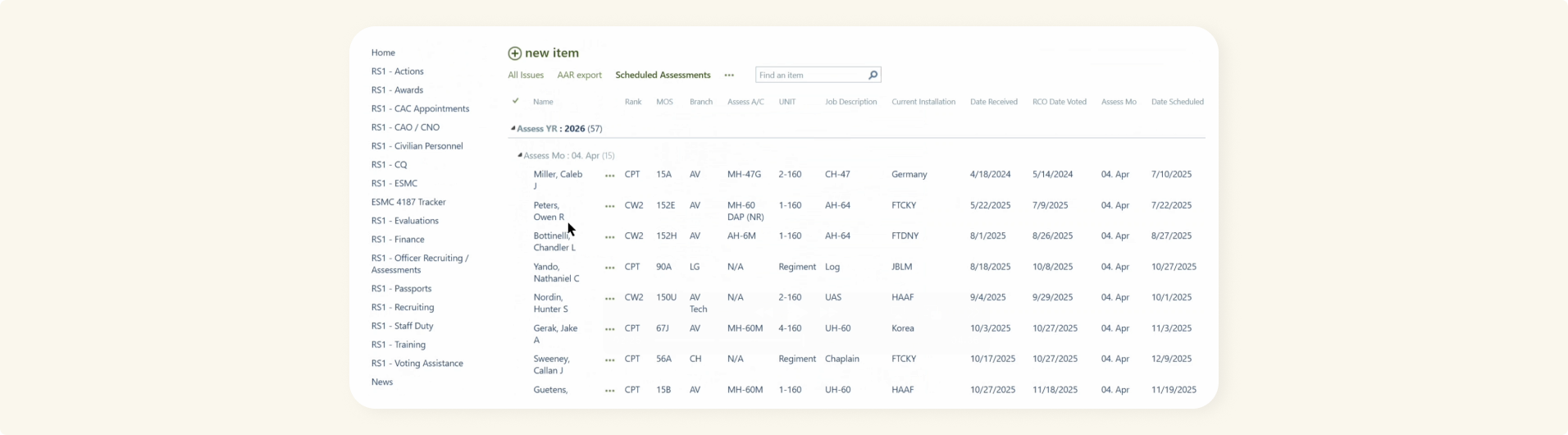
44 Pages, reviewed manually...
Evaluating 160th SOAR officer candidates was bogged down by a fragmented, 90-day review cycle. Reviewers relied on manual SharePoint workflows to evaluate dense 44-page packets across separate battalions, leading to severe administrative bottlenecks and subjective "gut-feel" scoring.
Goal
How might we standardize candidate scoring with a single, unified review dashboard?
Process
Following IBM's Enterprise Design Thinking framework, I actively engaged in the Observe and Reflect phases through 8 user research interviews. After synthesizing key insights and defining core problem statements with stakeholders, I moved into interactive prototyping.
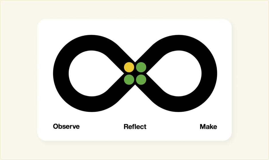
Rapid Prototyping with AI.
Why?
Sprint Velocity
Spun up a functional baseline in days, speeding up feedback loops between stakeholder reviews.
Realistic Synthetic Data
Generated complex edge-case candidate files (flight hour minimums, legal/drug flags, diverse ratings) instantly.
Live Flow Validation
Let key stakeholders test real, interactive queues instead of clicking through static mockups.
A solid foundation. A necessary redesign.
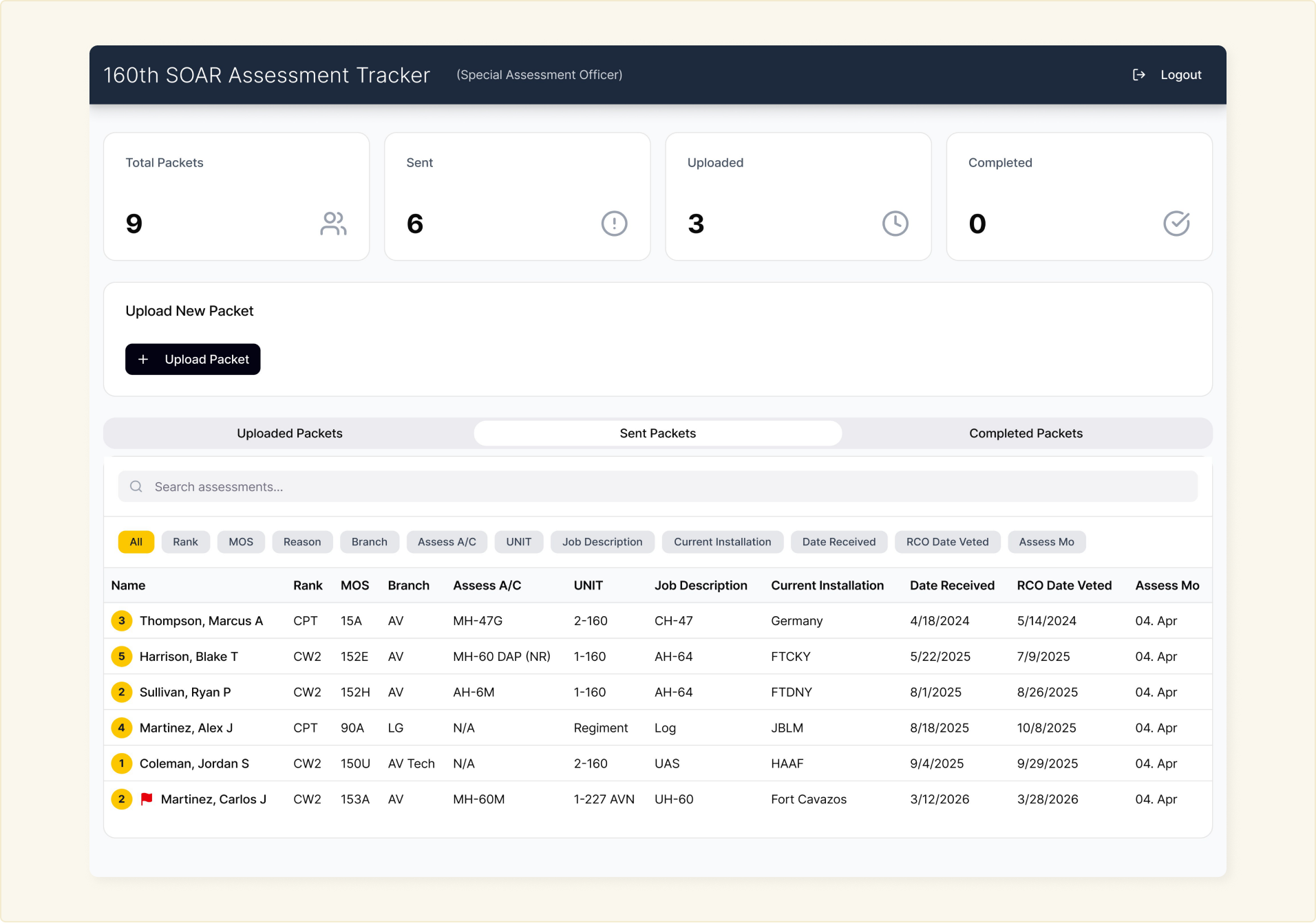
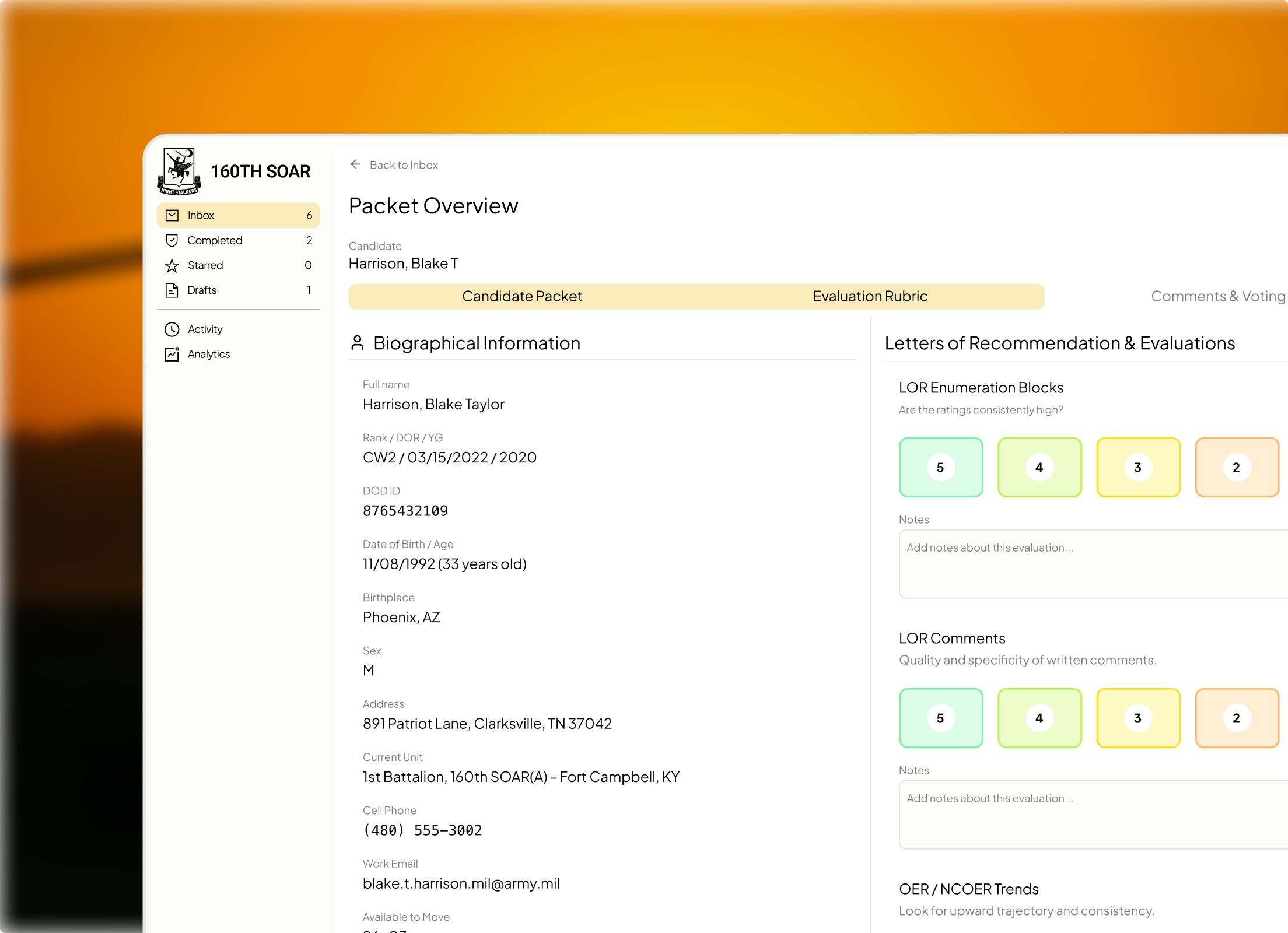
While the initial Figma prototype was functional, it lacked brand identity and suffered from structural flaws that cramped the viewing area and complicated navigation. I tackled these issues by establishing a foundational design system and overhauling the information architecture.
Design system
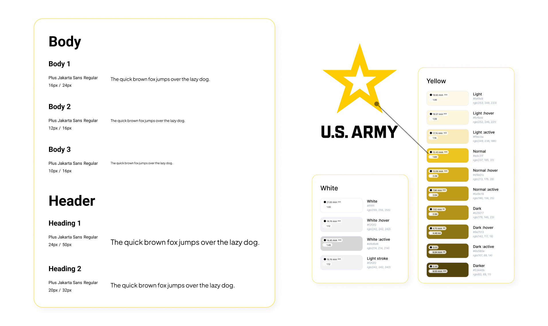
What the AI prototype lacked most were core visual rules, including color palettes and typography scales.
Information Architecture
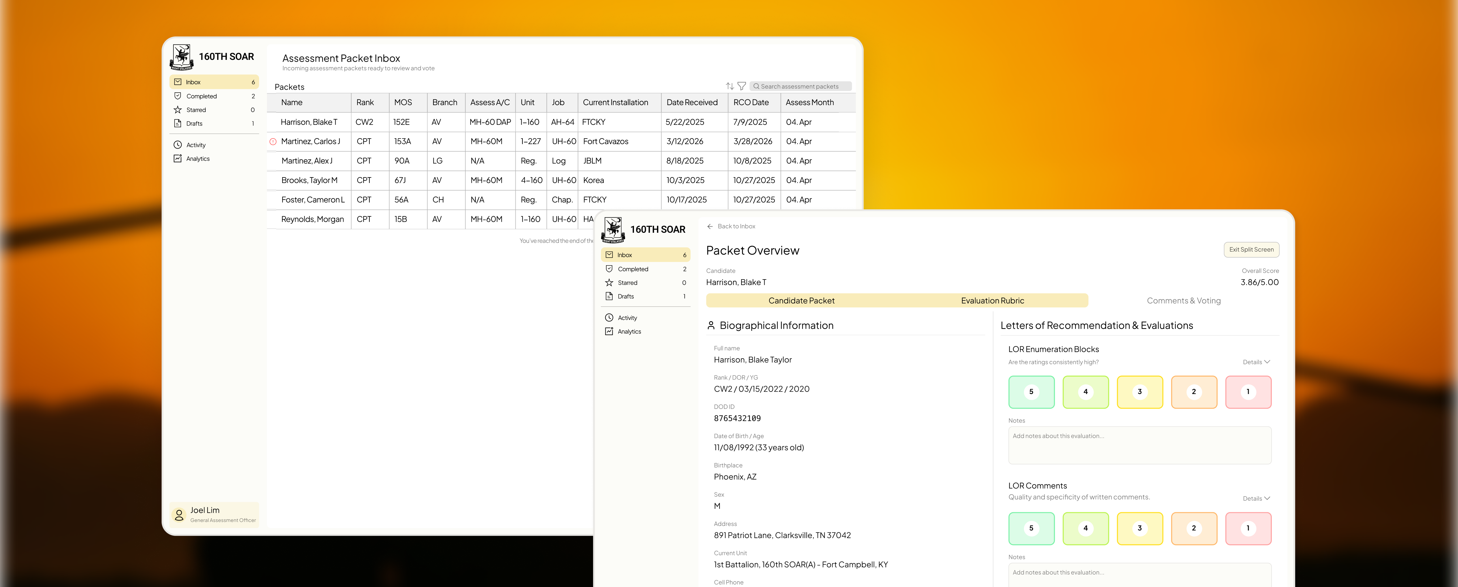
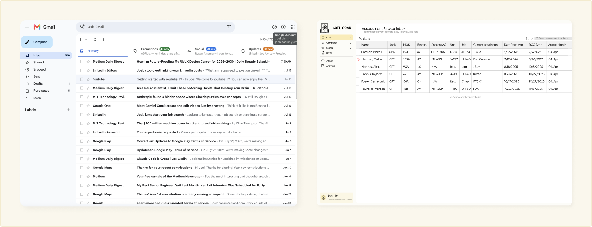
Categorized packets into four familiar buckets: Inbox, Drafts, Completed, and Starred. This cut down cognitive load when navigating high volumes of records.

Restructured the dashboard around familiar layouts like Gmail, introducing a dedicated sidebar to maximize the primary viewing area while cleanly compartmentalizing packet types and features.
Design
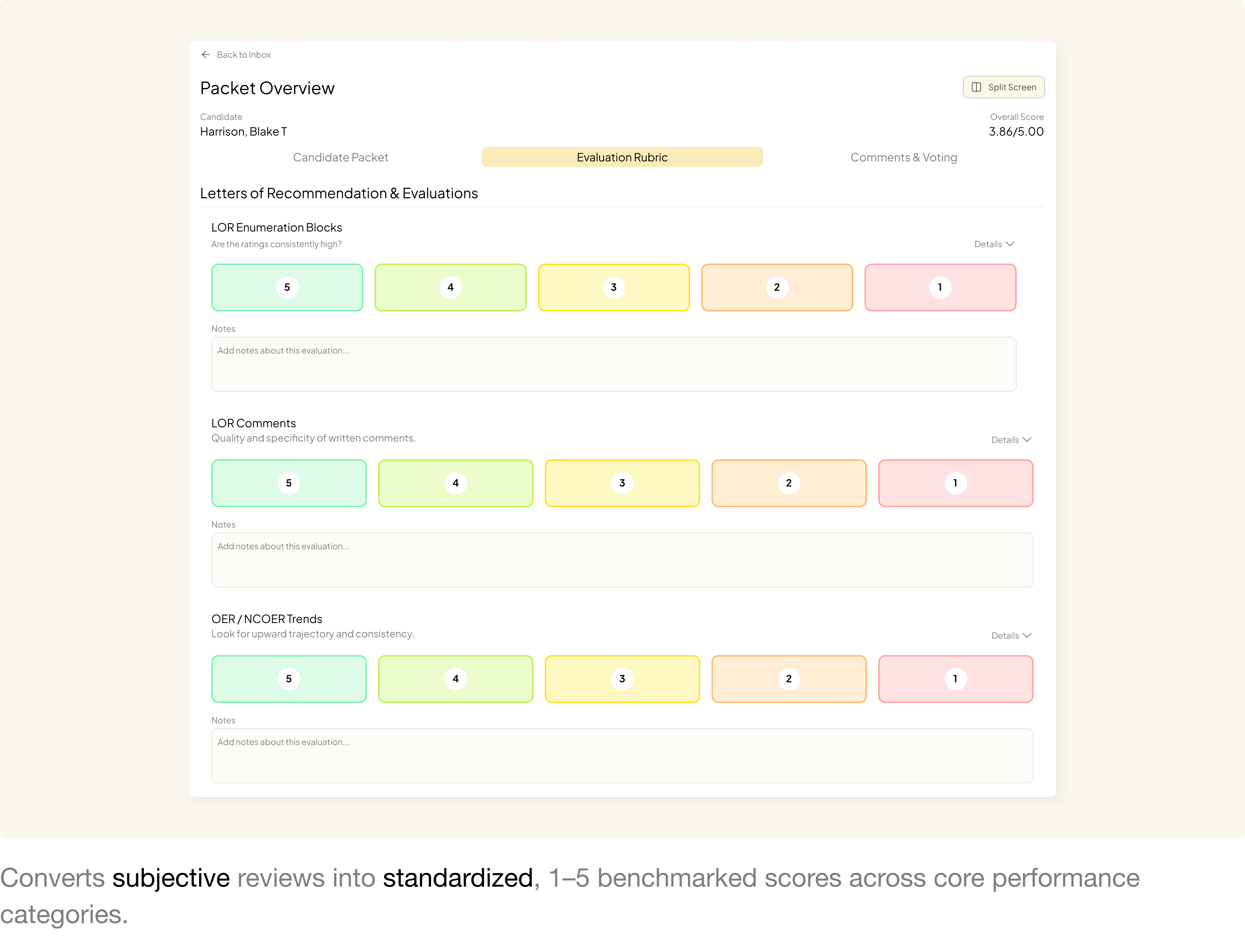
At its core - The Evaluation Rubric.
"Our decisions and what we do... is like extremely schizophrenic and changes and is a lot of like intuition and gut feel." — Assessment Officer
Converts subjective reviews into standardized, 1–5 benchmarked scores across core performance categories.
What started as a simple pdf...
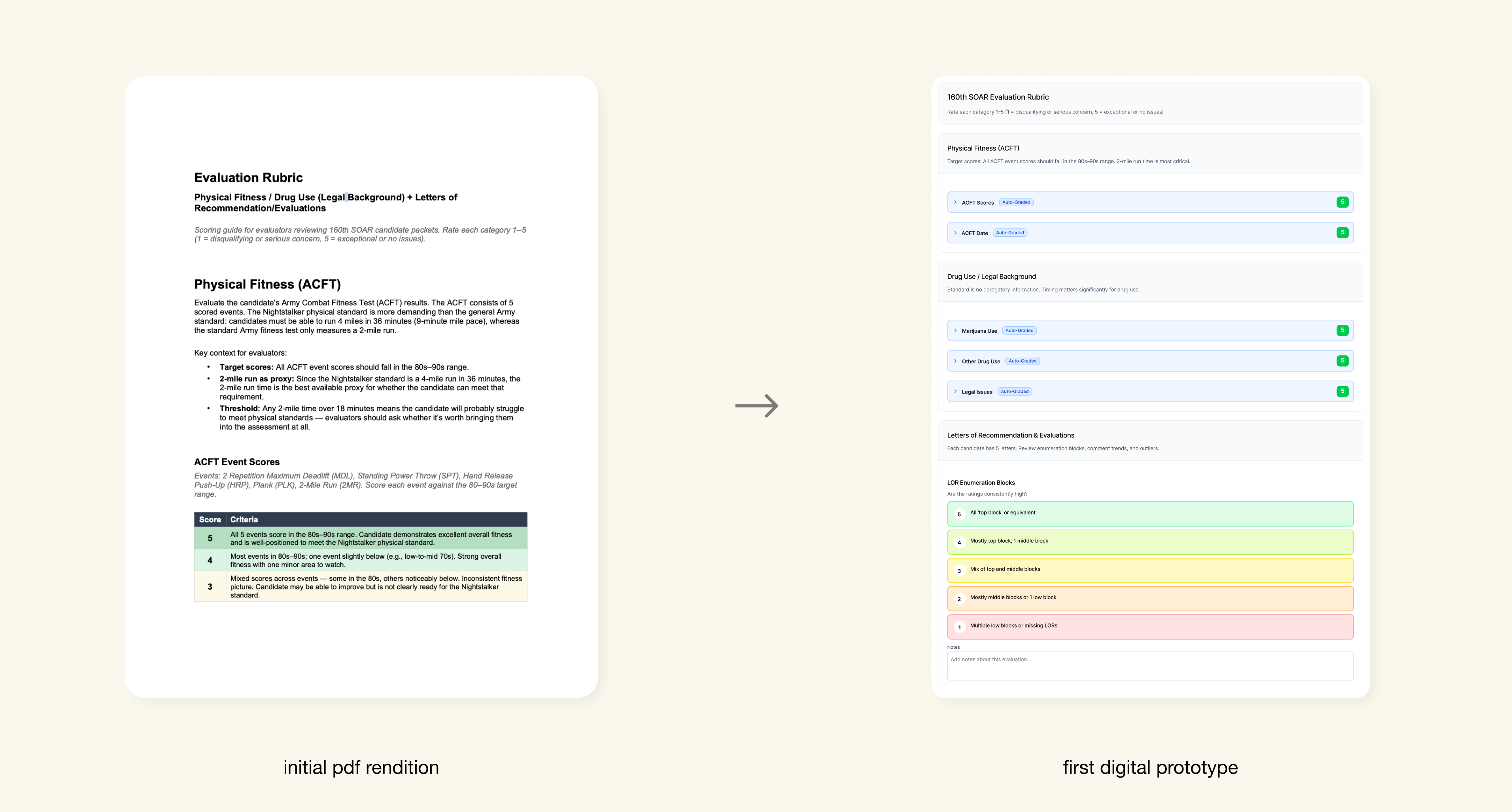
evolved into an interactive digital experience.
Introduced collapsible sections to maximize screen real estate and reduce cognitive load during dense packet reviews.
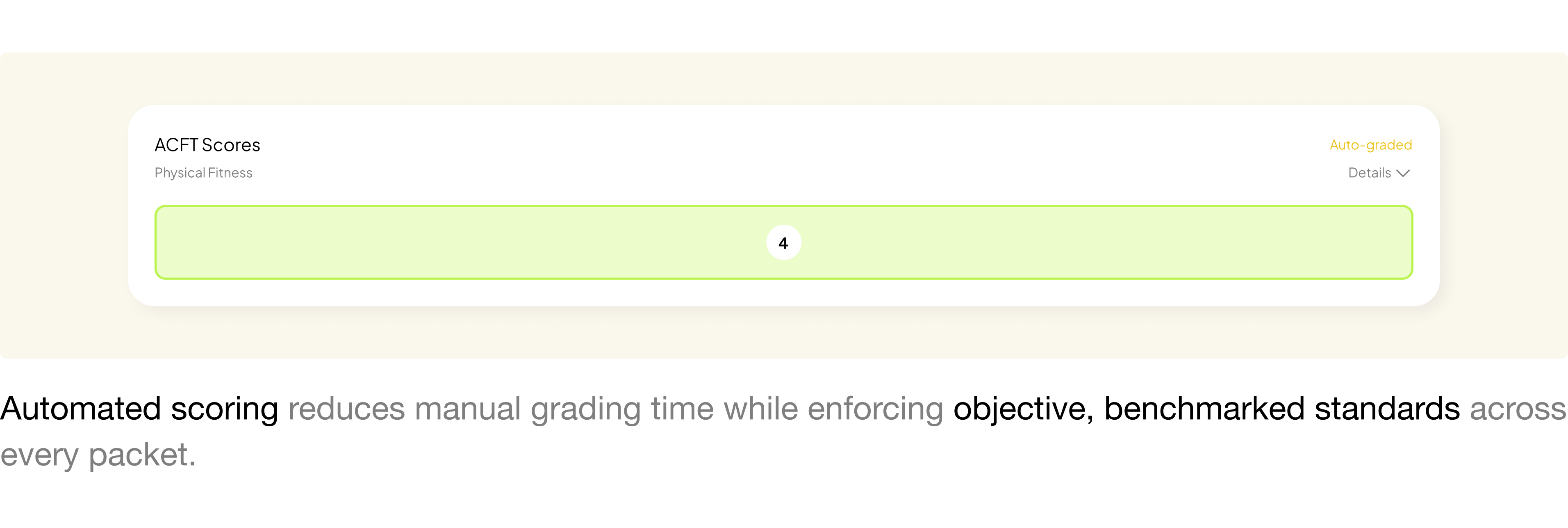
Remember, our users are military.
Designed for non-technical military personnel to pick up and use immediately, without second-guessing icons or workflows.
Hover tooltips over icons so you never have to guess what a button does.
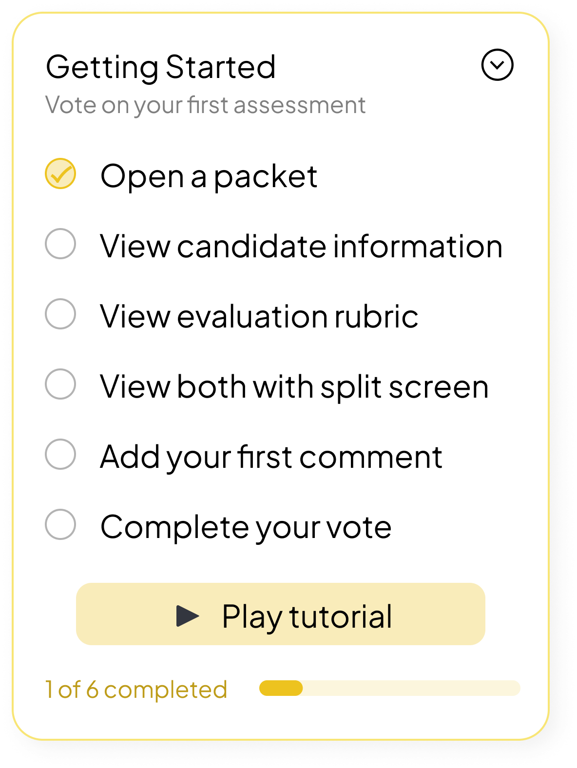
Onboarding popups to guide users through their next steps.
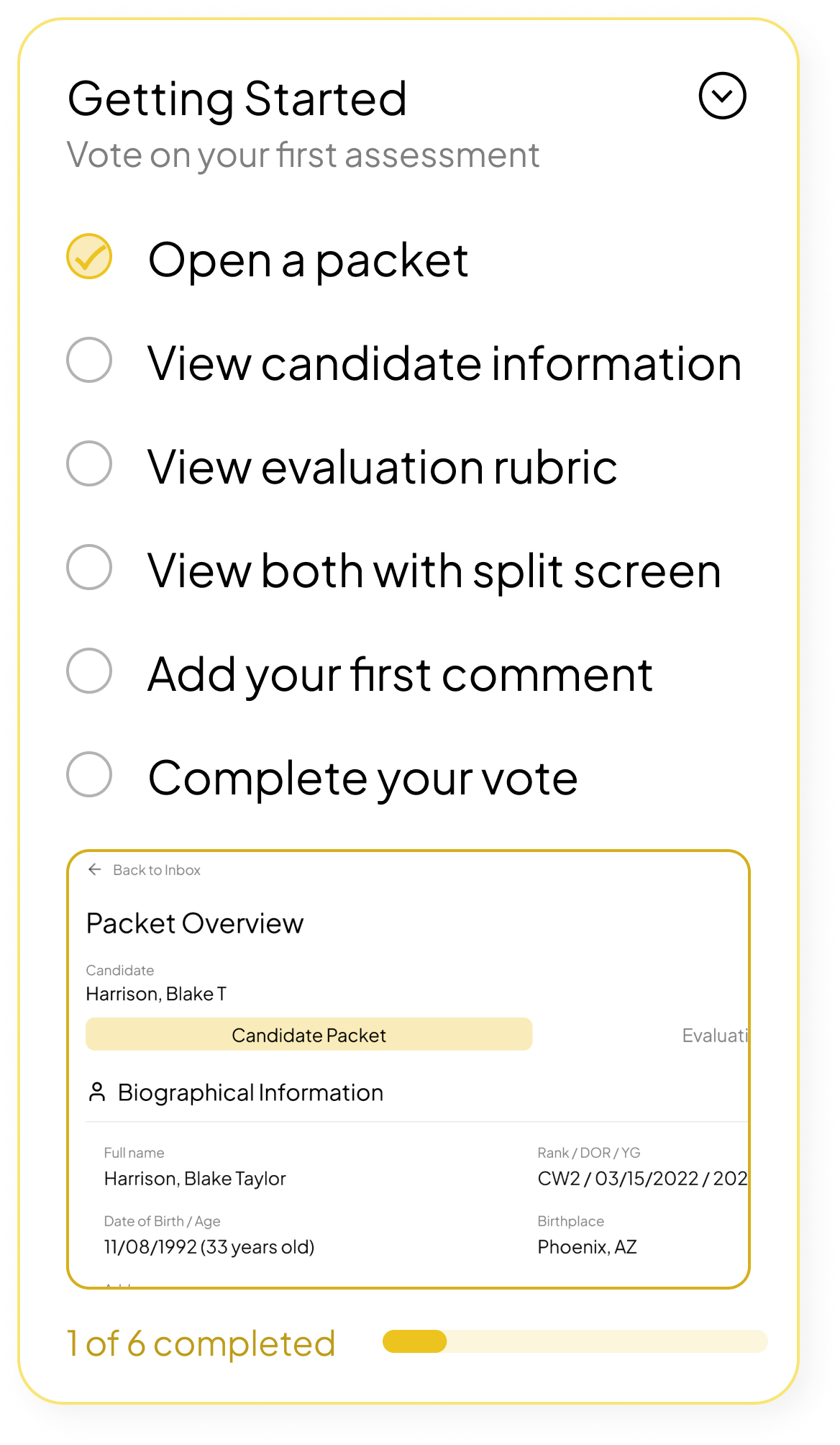
Interaction Design
I designed simple interactions grounded in UX principles and stakeholder needs.
Jakob’s Law: Traditional Sidebar
Replaced non-standard navigation with a familiar left sidebar, reclaiming core screen real estate and eliminating learning curves for reviewers.
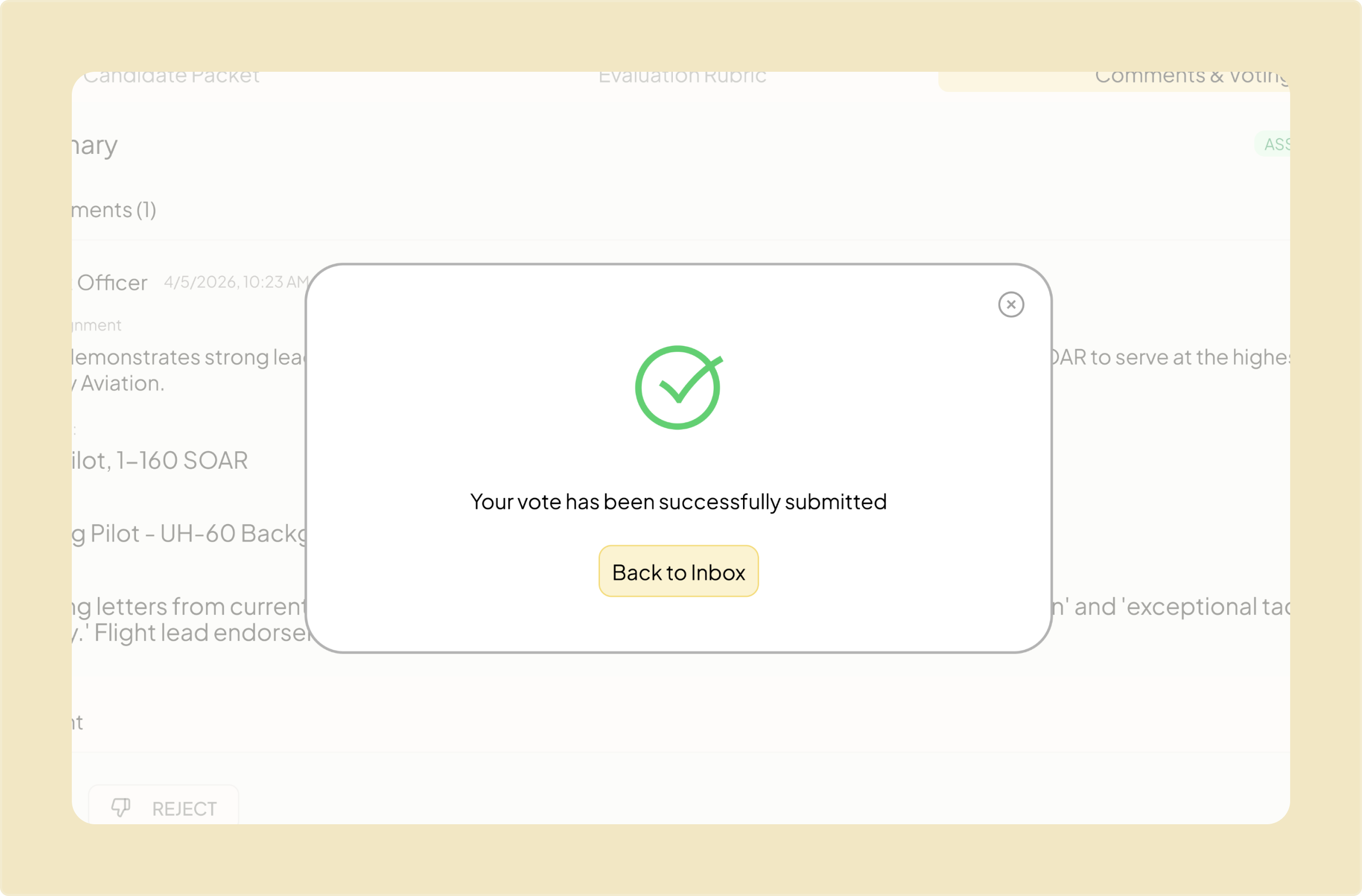
Peak-End Rule: Success States
Clear success states ensure the dense review process ends on a high note, giving users instant visual confirmation that their final vote was captured.
Simple interactions. Faster decisions.
The timeline from application to assessment: "average is, I think, 3 to 4 months... but it sometimes pushes to 9 months." — Assessment Officer
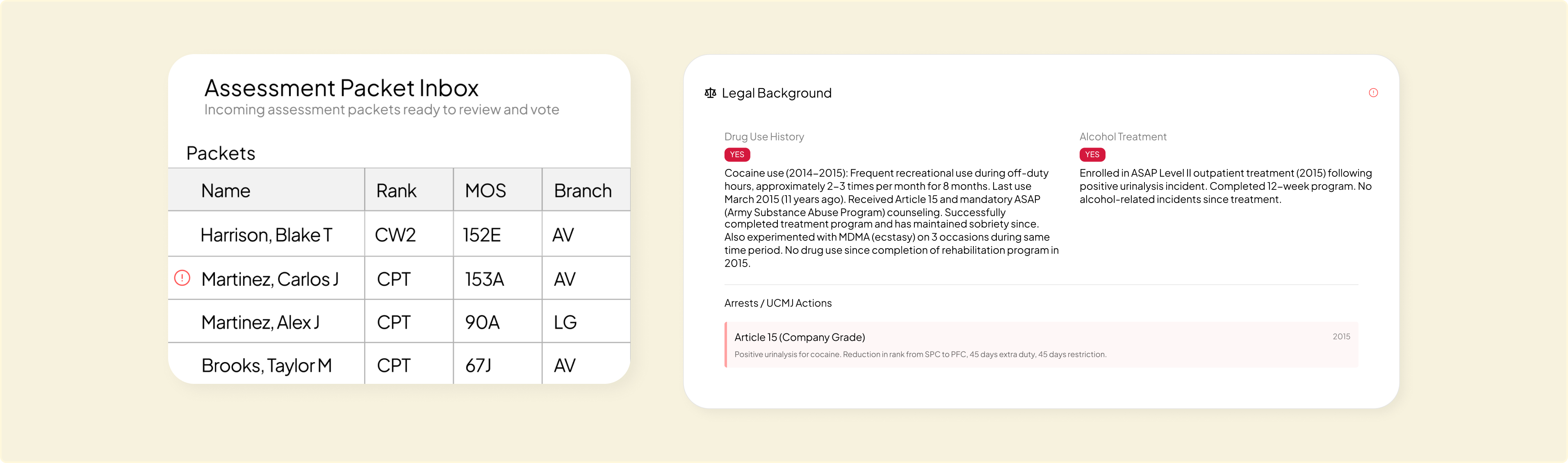
Flags disqualifiers early. Saves hours.
Our research found that: Packets with clear disqualifiers, like drug use, failed fitness tests, or legal flags, still move through the entire review chain before being caught.
Real-time tracking. Seamless handoffs.
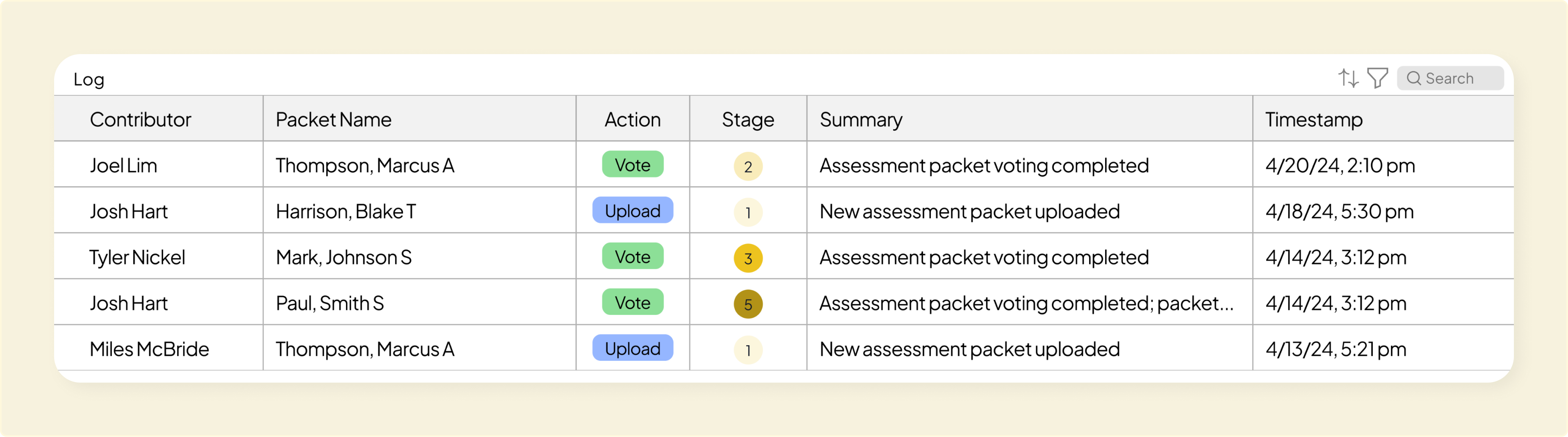
Live Activity Log: Keeps track of exactly who reviewed what and when, making sure packets keep moving without falling through the cracks.
Split-Screen View: Designed a side-by-side workspace directly requested by stakeholders to enable seamless cross-referencing and cut down review times.
Impact
"This is again, this is awesome. I wish it wasn't a prototype."
— Personnel Officer (S1)
Accelerated Review Time
Reduced individual review times from 30 to 12 minutes (timed user testing).
Cut Admin Overhead
Condensed 44-page dossiers into a single view, ending manual data entry and email threads.
Standardized Scoring
Swapped "gut-feel" reviews for objective benchmarks across 4 core evaluation areas.
Takeaways

User Research
8 rounds of interviewing real operators cuts through operational complexity and grounds design decisions in actual user pain points, not assumptions.
Using AI as a Tool
AI is great for spinning up functional prototypes in days, but hands-on design craft is what makes the product actually intuitive.
User-Centered Interactions
Building familiar, frictionless micro-interactions flattens the learning curve for non-technical users in high-stakes environments.

EDT Spring 26 @ Fort Campbell